|
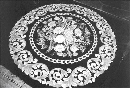
ISTANBUL
Pearl K. McGown -- 60" round
by Peggy
Hannum - Lancaster, PA
McGown
Newsletter, Spring Issue 2008
|
|
Having traveled in the Middle East for over 25 years and represented the United Methodist Church in Jerusalem for three years, I am enamored with the art and design of that part of the world. My time off each year is to attend Maryland Shores Rug School, in April, seeking out my friend and mentor, Nancy Blood, as my teacher. I am usually searching for a project and asked Nancy if she had any thoughts. Knowing my penchant for Persian motifs, Nancy suggested “Istanbul”--several times. Then a few years ago, my roommate at Northern Teachers' Workshop, Julie Mayo, was disposing of some patterns for a friend--one of which was “Istanbul.” The minute I saw it, I felt it had to be!
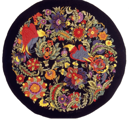
Nancy did the magnificent “all-color” color plan which evolved from Maryland Shores in April through Teachers' Workshop in July. Since no motif is repeated, the challenge is to move the colors around in different parts of the design. Like many of our rugs, they begin to tell you where certain colors are needed as the design is hooked. Everything does not have to be color planned at one sitting. This is part of the artistry.
Nancy sent sixteen formulas for swatches and background and I began dyeing--which for me is as much fun as the hooking! Almost all the formulas are from MaryAnn Lincoln's dyebook, Primary Mixtures.
The most difficult challenge was hooking the birds’ feathers. Since there was not a lot of definition in the blue and red swatches, the feathers all melted together. My previous teacher of many years, Meredith LeBeau, Salem, Massachusetts, had taught me a technique which she called “buttonholing:” take one thread from a dark piece of wool and hook around the edge of each hooked feather, thereby giving it the illusion of an outline--without it becoming a definite line. The rug hooked quite quickly for me because each motif was different; I wanted to finish one and go on to another to see what it would look like. The rug was finished in seven months.
An interesting sidebar to my “Istanbul” story happened at the monthly Blue and Grey gathering in Gettysburg, Pennsylvania, which I attend when I am able. I was working on my rug, and Yvonne Miller, a long-time, well-known teacher who happened to be attending that day, asked me if I knew the story behind the pattern. Pearl had received a birthday greeting from a friend with a print of a plate showing a design based on traditional Turkish decorative art and Yvonne had one of the cards! She was kind enough to allow me to copy it. It is quite different from my rug; it has a white background and uses the traditional blues, turquoises and rusts of lsnik pottery.
I feel with Nancy's guidance, “Istanbul” has been my best piece of work to date. It received the “Best in Show” award at the juried Gallery Show of The Pennsylvania Guild of Craftsmen; second People's Choice in Celebrations XIV, and will be on display at the Quilt and Textile Museum of the Heritage Center of Lancaster, Pennsylvania, from April through September of this year as part of their one year special show, “Rags to Rugs,” a retrospective of Lancaster County hooked rugs. It will then be retired to the art collection of my son, Bob, in Northampton, Massachusetts. Thanks to my children who gave me a website a year ago for Christmas, readers can view “Istanbul” and click on to enlarge and see close-up details of the rug:
www.peggyhannum.com
Color Plan for “Istanbul”
Background = Nancy's Color Beauties Primary D “Lincoln” (adjusted) over 1 yard Dorr 44 (1
Canary + 3/4 Peacock + 3/4 Cherry each in 1 CBW + 1/2 cup vinegar)
Birds = Maryanne Lincoln Primary Mixtures: “Rich Red” over Dorr Red Grapefruit;
“Buttercup” over Dorr Sunflower; “Confederate Blue” over Dorr 142 (all 8-value swatches)
Leaves = Maryanne Lincoln Primary Mixtures: “Foliage” over Dorr Celadon, Dorr 8218,
Woolrich Sand 819 and Woolrich Polly's Grayed Aqua 708,
Dorr Red Grapefruit, Dorr Sunflower and Dorr 142 (all 8-value swatches)
Flowers = Maryanne Lincoln Primary Mixtures: “Rusty Tulip” over Dorr 456 (double
formula), Woolrich Scarlet (triple formula), Woolrich Amber 301 (all 8-value swatches)
Flowers = Maryanne Lincoln Primary Mixtures: “Red Grape” over Woolrich Lavender, 632,
Woolrich Scarlet 401, Dorr 144 (all 8-value swatches)
|
|
|
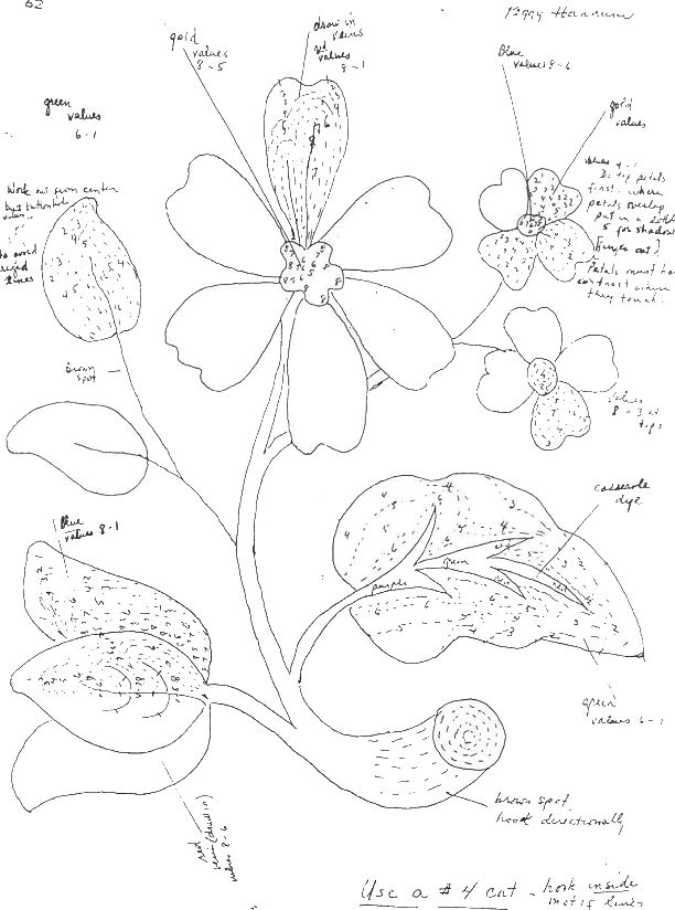
FLOWER POWER
The
Success is in the Details:
Hooking Flower
by Peggy
Hannum - Lancaster, PA
McGown
Newsletter, Vol. 32, #1, Winter 2003
|
|
When it comes to hooking flowers, my best successes have been in taking the time and having the patience to attend to the details. This is a slower process than shading a leaf, for instance, but worth the effort. There are, for most of us, two kinds of hooking: the ‘don’t think about it much and get it done’ variety which works well for me when I’m too tired to think but still want to put in my hooking time, and the other kind which says: ‘All right, this is a bit of a challenge, so let’s relax and not hurry it.’ The latter, for me, is the most fun and satisfying but unfortunately not my most
predominant mood!
Whether the flower is large or small makes no difference. The chrysanthemum pictured is from the center of Pearl McGown’s “Gainsborough” and measures 8 inches across and 6 inches deep. There are five of these chrysanthemums in the floral motif, so it was first of all, necessary to make each one slightly different in terms of color. The outer border of the rug is a gold scroll hooked in 8 value swatches of TOD 28-94. I had originally dyed this in 1981 when I worked on the piece. Last year I tried to duplicate the formula for one of my students and after several frustrating adjustments was finally able to replicate the color with the new Cushing dyes: 1/8+1/16 t. Canary, 1/16 + 1/32 t. Bright Green, and 1/16 + 1/32 t. Rust in 1 CBW in 8 jars over 8 pieces 13" by 15" of Dorr’s White wool, using the spooning: 1/2, 1, 2, 3, 5, 9, 14 and the rest. For a second yellow shade my teacher, Meredith LeBeau, provided her formula for a lovely pale yellow to light gold: ‘Meredith’s 22' over 8 pieces of 13 by 71/2 inches white wool, using Color Flow chart spooning for 2 colors. First Color: 1/32 t. Canary in 1/2 CBW. Second Color: 1/8 t. Old Gold in 1/2 CBW.
Using these two swatches, I was able under Meredith’s expert guidance, to achieve subtle variations in each flower by hooking one flower in the yellow swatch, one in the gold, and then cross swatching, using values 1-4 of one swatch with values 5-8 of the other. We worked on the top row of petals first, using the lighter values, 1-5, doing each one carefully attending to the shadows when one petal’s edge was under another. Then we did the second row of underneath petals in the darker values, 3-8. Since I was working full-time, it was relaxing not to hurry this and do a couple of petals each evening. In those days it took me a couple of years to finish a rug, I think three on “Gainsborough,” but looking back, the time spent on detail produced some of the loveliest results.
So much for the BIG flowers. This year I finally finished Pearl McGown’s “Unicorn in Captivity,” with a background of mille fleurs, each one approximately a half inch in diameter, with only a few larger, but none more than one inch. I began this about twenty years ago, also with Meredith, and at that time under Meredith’s expert guidance had finished the unicorn and part of the fence. I had done about three flowers and with just two or three values in each of these tiny motifs. When I decided last year that it was about time to finish this piece, I began to hook a few more flowers, but found I really became caught up in shading each little one, using sometimes all eight values as in the irises and the trumpet flowers and at least five values in the rest. I really found it relaxing to do perhaps only two little sprigs an evening.
The key to successfully creating tiny detail in both pieces was in using a #3 cut and packing the stitches in tightly, sometimes, especially with the mille fleurs, putting two stitches in one hole. Also, doing the background as you go is crucial. To do points and small details, you can ‘push stitches around’ by going into the same hole in the flower petal with the
background color to achieve the fine detail you want.
All of this takes time, but the slower pace is a relaxing one as well. We all have more than one project going at a time. It is good to have that outline and fill one, but it is relaxing to have a slower, finely detailed piece also, a rug “for all seasons.”
|
|
|
Consider a Portfolio
by
Peggy Hannum - Lancaster, PA
McGown
Newsletter, Vol. 32, #3, Summer 2003
|
|
Every now
and again someone will ask me if I have
sold any of my rugs. My somewhat shocked
response has been: “No, and I haven’t
sold any of my children either!”
Recently, I have come down off my high
horse a bit. Until I retired, it took me
two or three years to finish a rug, and
in one case seven. When you live with
something that long, it is part of your
family. Now I am hooking three or four
rugs a year. I am a night person, and it
is amazing to me how much one can
accomplish between 8:00 and 11:30 at
night.
I have
come to the point that I am hooking rugs
because I want to see what can be
achieved with color and form, not
because I am trying to create a spot of
beauty on a particular space of floor or
wall. In that respect, I have reached
‘critical mass,’ and the thought of
giving some away to my family surfaced
recently when I decided to draw and hook
my grandson’s cat, “William’s Cat.” I
held onto it for a year or so, putting
it in various rug shows, but having run
out of those, faced the fact that
perhaps I really should part with “one
of my children” and, long overdue, give
the rug to William for Christmas. Having
finally made that decision, a whole
floodgate opened, and I began planning
which other rugs to give to my sons and
daughter. I certainly didn’t have the
excuse that, “Oh well, my
daughter-in-law would probably put it in
the garage.” They all value my rugs as
much as I do.
My only
lingering regret was that once they were
gone, they were gone. I had an album of
photographs, but somehow that didn’t
seem to have the permanence I wanted.
Synergy does affect life, and things
have a way of happening simultaneously.
Last summer we were vacationing in Maine
with our son and his family at the home
of Bob’s friend from college whose
avocation is painting and who displays
his works in a gallery near his home in
Santa Fe. David shared his portfolios
with me which were quite impressive and
professionally done. My thought was that
it would be wonderful to have something
lasting and of this quality to display
my own art work, but I thought it would
be out of my price range.
David’s
sharing his portfolio and explaining how
it was done was the answer to my need to
have a lasting illustration of my rugs
before some were dispersed.
The
process is not difficult nor any more
expensive than the cost of doing a large
rug or attending a rug camp. The largest
expense is incurred in the initial
photography. The rugs need to be
professionally photographed which might
cost between twenty-five and thirty-five
dollars apiece. I was fortunate to be
close to Bill Bishop who does the
photography for Rug Hooking Magazine so
was able to take my pieces to his studio
where they could be hung on a wall to be
photographed. Perhaps, you are talented
enough to do this part of the process
yourself.
The next
step, or perhaps even before you have
the rugs photographed, is to go to a
photocopying shop. I chose Sir Speedy as
it was close to me, but any similar
business will charge about the same. The
personnel were very helpful even to the
point of speaking with the photographer
and asking him to put the photos on a
disc which they then can put into their
computer to print out.
After I had proofs of the
photos, I laid them out and hand printed
my copy where I wanted it on each page,
keeping the text to a minimum. I
included the name of the rug, the size
and the designer in one blurb; in a
second, hand dyed on which backing, the
number of the cut and the year
completed; in a third, listed any
publication and awards; and lastly, if
appropriate, briefly, the inspiration.
My
dedication page was
inscribed to my two teachers, Meredith
LeBeau and Nancy Blood who have been my
friends and mentors during my
twenty-seven years of rug hooking. My
son, Bob, who has an art background,
suggested not using the same layout on
each page but positioning the pictures
and texts differently. It was good
advice.
One
important factor was that Sir Speedy did
a proof run before printing all ten
copies. This was, as it turned out,
critical as the photos all had a decided
greenish tint, which was due to the
particular copying machine they were
using. They were not satisfied nor
was
I, so they assured me that they would
produce a piece we would both be proud
to have. The color in the second proof
was excellent. Only after I felt it was
satisfactory was it printed.
The
Christmas gifts were much appreciated,
and I now have a very professional
permanent record of my art work. The
best part, however, is that many of my
students wanted to purchase copies as
well, so that meant that even though I
have not written the great American
novel, I can say that I am in my second
printing! And the even nicer addendum is
that the more you print, the less
expensive it becomes per page. Sir
Speedy has the book in their computer
and all they need to do is press the
button to print out more at any time.
Consider
a portfolio! |
|
|
SALEM – A Story of ‘Life Interrupted’
Heirloom Patterns – 46” X 82”
- #4 cut
By Peggy Hannum, Lancaster, PA
McGown Newsletter, Vol. 34, #2, Summer 2005 |
|
I
began Salem somewhere in the
vicinity of 1989. I had selected
this pattern because it would be the
perfect rug against the wide pine
floors in the upstairs hall in our
old Federal home in Danvers, MA. My
teacher, Meredith LeBeau, helped me
plan the colors to match the
wallpaper and décor of the hallway.
With her expert eye for color and
hooking technique, I was underway. I
finished the center with all its
fascinating and rather bizarre
flowers and optimistically dated
this part, 1993.
I
guess I planned to finish the border
in short order. However, life’s
plans are not always our own! Later
that year my husband and I both
retired early from our careers, he
as a United Methodist minister and I
as a high school English teacher. We
accepted positions as Liaisons to
Jerusalem for the United Methodist
Church. We sold our home and
everything went into storage for the
duration.
Three
plus years later when we returned,
resettled in Lancaster, PA and
unpacked, there was the stack of
‘the great unfinished.’ I have been
chipping away at this mound over the
ensuing eight years, but poor,
orphaned Salem just hung around,
draped over an old wooden hooking
frame. The center was pretty to look
at, but the ‘perfect hallway’ was no
more. Finally, since the burlap
(which unfortunately was not too
great to begin with) was beginning
to look worse and worse, I undertook
finishing the border. This was a
bigger project than I thought, since
I had only done one set of scrolls
earlier, but I managed to finally
finish it in several months during
the winter of 2004. It looks
perfect in a bathroom with dark wood
floors.
Several very important lessons were
learned with Salem. First and
foremost, Meredith had practically
imprinted on our foreheads: keep a
notebook and very precise notes on
each rug, i.e. Dye formulas, fabric
you dyed over and exactly what the
dyeing process entailed. I had these
notes carefully recorded and more
than a decade later was able to redye
some background for the border
and an extra batch of coat hanger
dip dyes for the scrolls. I even had
samples in my notebook from selvages
of the fabric I had over dyed for
the scrolls, which turned out to be
crucial. I had used a piece of aqua
green, purchased at some New England
mill for my green. The color was
unmatchable, but having that little
piece, I was able to dye a piece of
white wool the correct shade of
green and then use it in my dip dye.
The new batch matched the older dyed
wool very well. I also had to match
the peach background in the border.
Again, my notes said: dyed over
white wool, but the white sample I
had from the mills was more on the
order of Dorr’s Natural. When I
redyed, the peach was a bit brighter
than the older stuff, so by eye I
just dipped it in a tea bath, having
a wet piece of the old wool beside
me. Again, it came out quite a good
match.
A
second good lesson from this project
was: try to dye enough wool at the
outset to do the whole rug. I
actually thought I had done this,
but as I hooked another complete
scroll, I started measuring how much
wool I used in one scroll and it’s
background. I soon realized I would
come up just a little short. It was
at this point that I stopped and
dyed enough more to comfortably
finish the border. I was able to mix
batches together as I went along so
there were no perceptible difference
in color.
An
interesting discussion about borders
began to evolve whenever I took this
rug-in-progress somewhere. The
conventional wisdom on borders of
rugs tells us that the final edge
should be dark if the center
background is dark so that the rug
appears to “lay on the floor.” I
certainly have found this to be true
for most of my rugs. So, I proceeded
to dye a bit more of the center
background and for a foot or so
added a dark brown border about 6
rows deep. For every rule there is
an exception, and this seemed to be
it. The dark edge suddenly made an
interesting and folksy rug look very
ordinary. Needless to say, the dark
edge went. Which tells us, you just
have to try things and let your eye
tell you what looks right.
When
I was dyeing for Salem, close to two
decades ago, one dyed almost always
over white or natural wools. What a
world of color has opened up since
then with dyeing over a myriad of
colors of wools!
All
of the following formulas are dyed
over what would be equivalent to
Dorr’s Natural:
Backgrounds:
Color Flow 46 doubled
over 13” X 15” wool –
Outer
border background is value 1 and
center background is value 8
Scrolls: Coat hanger
dyeing (Scrolls Are Easy by Laverne Brescia)
Follow her
directions using white, beige,
yellow, pink, green and blue wools
Formula #14
(1/4 t. each of Old Gold, Old Rose
and ¼ minus 1/32 t. Olive)
Flowers: Navy to Rose – Chroma Craft 57
Maroon to
Peach – Color Flow 92 tripled over
13 X 15 pieces of wool
Blue – Color
Flow 76 tripled over 13 X 15 pieces
of wool
Gold –
Jacobean 5
Greens: Color Flow 19,
Connie’s 27, 29 and 30 and a Sage
Green that I had. |
|
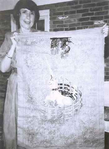
"The
Unicorn"
(OSV #880 -
24" x 36")
Submitted by Margaret Hannum,
Lancaster, PA
McGown
Newsletter, Vol. 27, #4, Nov 1998
|
|
Recently, I
came across an article in the Sunday New York
Times "Travel" section (May 31,1998),
entitled "On a Unicorn Hunt in France." (It
seemed "recent;" time is relative the older one
gets, I find). The account tells the fascinating
history of Aubusson, the little town in central
France, from its 16th and 17th
century heyday when both the nobility and
royalty of France commissioned tapestries for
their large castles along the Loire River to its
near demise after World War I when tastes
changed and the demand for religious and hunting
scenes, produced and imitated for centuries,
fell out of favor. Nevertheless, the St. Jean
family has continued the tradition; once,
Aubusson had employed some 300 workers; now
about a dozen artisans repair priceless ancient
pieces and accept commissions. One can tour the
Tapestry Museum at the Manufacture St.-Jean
where is displayed, among other pieces, the
prized design of a carpet that graces the Red
Room of the White House.
The article
stirred my memory of Pearl's pattern, "The
Unicorn," an adaptation of The Unicorn in
Captivity, the seventh tapestry in the
series, The Hunt of the Unicorn, housed
at the Cloisters (Metropolitan Museum of Art),
New York. Several years ago I began the
piece-the "several" being, again,
relative-attested by the $15.00 price tag. In
those years, I was studying with, apprenticed to
and sitting at the feet of, my excellent
teacher, Meredith Le Beau; with her inspiration,
we planned, and I began "The Unicorn."
I bought a poster
at the Met on a subsequent visit to New York,
but was unable to see the actual almost 6' tall
tapestries as The Cloisters was closed for
renovations at the time. I planned to return as
soon as possible to see them which I hope to do
"in the near future." With the help of the
poster, we were able to copy as closely as
possible the colors for the hooked piece. On the
poster, there are several drops of "blood" on
the unicorn's chest and body which I put into my
piece as well, feeling that added more poignancy
than just the wistfulness in the chained
unicorn's expression-he had been mortally
wounded in the hunt and afterwards resurrected.
That all was "a
while ago." When I began to think about this
article, I decided it might be judicious to be a
bit knowledgeable about the subject, so I
checked with the local library and found a
wonderful resource: The Unicorn Tapestries
by Margaret B. Freeman, Curator Emeritus of the
Cloisters. I highly recommend the book, not only
for the beautiful color plates, but also for the
history and detailed description of each piece
and adjunct interpretations. Much to my chagrin,
Ms. Freeman, in describing the ripe pomegranates
hanging from the tree, notes that some have
burst so that "their seeds with their red juice
have spilled onto the unicorn's milk white
body." So much for my wounded unicorn-poignant
and wistful. All was not lost, however... there
are, according to Ms. Freeman's account, several
interpretations: one being, the allegorical love
hunt described by medieval poets in which the
bridegroom is captured and at last secured by
his adored lady-the "wistful" look. I presume:
or it may be interpreted as the risen Christ in
the midst
|
|
|
of a Paradise garden.
Symbolism is really great
because one can find one's
own interpretation. Somehow,
the wounded unicorn
fits
my fancy better than spilled
pomegranate juice.
I really have plans in the
very near future to continue
working on my unicorn. After
all, the hard parts are
finished: the color
planning, the dyeing,
hooking the unicorn and most
of the fence, which was no
mean feat, shading it to
catch the light and achieve
the rounded effect. The tree
is begun, and eleven of the
mille fleurs are
done,
leaving only 989 more,
no doubt!
The article in The New
York Times noted that
the seven unicorn tapestries
were probably woven in
France in the 17th
century; they
disappeared during the
French Revolution, only to
resurface in the 1850s on a
farm,
where six of them were being
used as coverings to protect
vegetables against the
frost. In 1922, John D.
Rockefeller, Jr., bought
them and later gave them to
the Met. In 1936, |
|
|
fragments of the 7th
(5th in the
series), were discovered in
Paris and sold to the museum
where all seven now grace
The Cloisters-a checkered
past indeed! I do have a
very large vegetable garden
and, as Fall approaches, do
look to cover those last
tender
lettuce
leaves, BUT history will not
repeat
itself in the
Hannum back forty. I also am
promising myself that I will
get back to this lovely
piece "very soon." |
|
Formulas for Dyeing the
Unicorn
Background:
over 1/2 pound or 1/2 yard.
of navy wool, use 1/2 Aqua
in pan of boiling water
with vinegar cook 20 minutes
to achieve an antiqued look.
ALL the following formulas
are dyed over white wool
using gradations of 8 values
(except
the one Jacobean formula
which is 6) and cut on a #3.
I used Cushing dyes-probably
a
combination of both the new
acid and the old union dyes;
1 used both salt and vinegar
in
the dye baths. I prefer the
softness and subtlety 1 can
achieve with the Cushing
dyes, but
in truth, have not used,
only observed, the Pro Chem
results. Another one of
those things
I need to work on "sometime
soon."
Unicorn: Ethel Bruce
233, using lighter
gradations (see chart
below). 8 pieces: 71/2" x
15"
3/16 Olive Green +1/16
Mahogany in 1 CBW
Spooning for Light
Gradation Chart: 1/8,
1/4, 1/2, 3/4, 1, 1 1/2,
1 T, 2 T.
[ used mostly values
1-6, working values 5
and 6 for the shadows 7
and 8 for the hooves,
mane curls, facial and
body delineations.
Horn:
dip-dyed some narrow
Ethel 233 strips with a
bit of Rose for a
pinkish blush. Dark
pink of flower color for
blood and a touch in the
comer of the eye; blue
for the eye
and leather collar,
studded with gems
(flower colors). Gold
buckle and chain.
Fence:
Ethel Bruce 322 using
Color Flow Method for 3
colors. 8 pieces: 12" x
15"
Color 1:1/16 Orange in
1/2 CBW - with 1 T. in
each jar
Color 2: 1/8 Khaki Drab
in 1/2 CBW - use Color
Flow Chart for 2nd
of 3 colors
Color 3: 1/8 Myrtle
Green +1/16 Reseda -
together in 1 CBW - use
Regular
Gradation Chart for 3rd
color - 1/4, 3/4, 1 1/2,
1 T., 2 T., 3 T. + 11,5
T., Remainder
This moves from an
orange to a green which
reflects the tapestry
colors well. This swatch
was carried into the
pomegranates for balance
which is true to the
original as well.
Tree
Leaves:
Ethel Bruce 258 using
Color Flow Method. 8
pieces: 12" x 15"
Color 1: 1/4 Bronze in
1/2 CBW - with 1 T. in
each jar
Color 2: 1/4 + 1/8
Copenhagen Blue in 1
CBW- Regular Gradation
for 2nd color
Flower
Leaves and Tree Trunk:
Ethel 258 and Color Flow
19. 8 pieces: 13" x 15"
Color 1: 1/8 Gold in 1/2
CBW - with 2 teaspoons
in each jar
Color 2:1/4 + 1/8 Bronze
Green in 1/2 CBW - use
Color Flow Gradation for
2 colors
Blue
Flowers:
Jacobean 11.6 pieces:
12" x 12"
1/4 + 1/8 Blue and 1/2 +
1/8 Apricot in 1 CBW
(used with old dyes, so
cut the
Apricot to 1/4 as the
new Apricot is VERY
Orange - gradation 1, 2,
1 T. + 1 t, 2 T.
+ 11, 4 T. + 1 t.,
Remainder
Yellow
to Mahogany Flowers:
Ethel Bruce 292. 8
pieces: 12" x 15"
Color 1: 1/8 Yellow in
1/2 CBW - with 1 T. in
each jar
Color 2: 1/2 Crimson in
1/2 CBW - use Color Flow
for 2nd color
spooning
Color 3: 1/8 Plum in V2
CBW - use Color Flow 3rd
color spooning
Blue
Green Flowers:
Meredith LeBeau 12. 8
pieces: 13" x 15"
Color 1: 1/8 Myrtle
Green in 1/2 CBW - with
1 T. in each jar
Color 2:1/2 Peacock
+1/16 Maroon +1/16 Blue
" all in 1 CBW
Gradation: 0, 1/8, 1/4,
etc. - down to 3 T. +
It. (see fence above)
White
Flowers:
Unicorn swatch
Pink
Flowers:
Family 31 TOD 102. 8
pieces: 7" x 9" (See
fence gradation above)
1/2 Maroon + 1/16
Cardinal + 1/16 Mahogany
-- all in 1 CBW
Gold Flowers
and Chain:
Meredith LeBeau 22. 8
pieces: 71/2" x 13"
Color 1: 1/32 Canary in 1/2
CBW - with 1 T. in each jar
Color 2: 1/8 Old Gold in V2
CBW - Color Flow for 2nd
color
I
will toy to balance the use
of flower colors throughout
as is done in the tapestry.
|
|
|
|
|
"Gainsborough"
(#OSV 440)
Pearl K. McGown
Submitted by Peggy Hannum,
Lancaster, PA
McGown Newsletter, Vol. 28, #3, Aug 1999
|
|
Twenty years ago, when I first started
rug hooking, I purchased all of Pearl
McGown's books. Since I was teaching
full time and caring for a family, I
spent my free evenings leafing through
the books and dreaming about the rugs I
would someday create, too tired to
actually hook. However, I was fortunate
enough to happen upon a one-of-a-kind
hooking teacher, Meredith LeBeau, who
taught weekly evening classes, and it
was with Meredith that I embarked upon
my all-time favorite, "Gainsborough,"
pictured in Pearl's book, You... Can
Hook Rugs.
The
gold scrolls against the black
background in the illustration were
exactly what 1 wanted; the effect
was dramatic. I matched the scrolls
to a wool carpet (gold) which lay
beside my rug in the living room. I
wanted also to bring in a blue, a
rose and a white (for the tulips) to
complement the other colors in the
room. Meredith suggested doing the
scrolls in an 8-value swatch and
hooking the chain with black
background in the centers to
give it a lighter effect rather than
the usual solid "peacock eye." Ever
since then, and after working
scrolls with dip, casserole,
Transcolor and coat hanger
dyeing-you name it - I still prefer
using an 8-value swatch, which, for
me, is easier to control. A
therapist could make an interesting
analysis out of this! The other
dyeing methods offer more freedom of
expression-or so it is said-and I am
working on that!
The
floral center was a delight to do.
The central rose used a pale
blue-to-gray swatch. I have had a
fantasy ever since childhood about
blue roses and. as a matter of fact.
I am still ordering "blue" roses
from garden catalogs, which I well
know by now will always turn out to
be lavender. Here was my chance,
finally a blue rose! Probably
another opportunity for the
therapist. The chain and the
foxgloves are blue to green in the
centers, while the chrysanthemums
are two swatches of yellows
intermingled. The outer roses are
deep red to almost white. The rose
buds are in the blue tones and the
deep red. The white tulip became a
white to pale green.
"Gainsborough"
is still my favorite rug and is as
bright as it was 16 years ago. I really
love the black background. It makes an
"entrance"--an elegant queen mother in
my living room. Although I am now
retired and the kids have gone, I still
find I spend an inordinate amount of
time leafing through books and magazines
dreaming about the rugs 1 will someday
hook. Perhaps this is my twist on
Pearl's first and delightful book,
The Dreams Beneath Design, my
"designs dreams are made of."
Formulas
used in "Gainsborough"
Scrolls:
Meredith's variation on Family 28 TOD 94
which was too greenish
1/4 + 1/8
Canary
1/32 +
1/64 Bright Green all in 1 CBW
13x15 pieces of wool
1/16 + 1/32 Rust
TOD gradations
Chain. Ferns. Foxgloves:
Color Flow 73 - a grayed light blue to
deep green
Color Flow measurements
Chrysanthemums:
Meredith LeBeau 22
1st
color: 1/32 Canary in 1/2 CBW CF
measurements
2nd color: 1/8 Old Gold in
1/2 CBW 13x71/2 pieces of wool
Also gold swatch from scrolls
intermingled with M 22
Tulips: Ethel
Bruce 180 - green to green
1/4 Bronze Green
3/32 Medium Brown all in 1/2
CBW
2/32 Nugget Gold 13x15
pieces of wool
Measurements: 1/8 -1/4 -1/2 - 3/4 -1 t.
-1 1/2 t. - 1 T - 2T
Center Rose and Buds:
Ethel Bruce 278 - pale blue to grayed
rose
1st
color: 1/16 Aqualon Blue in 1/2 CBW
CF measurements
2nd color: 1/8 Orchid in 1/2
CBW 13x15 pieces of wool
3rd color: 1/8 Crimson + 1/16
Medium Brown in 1/2 CBW
Roses: Family
31 TOD 102 - almost white to dark red
Leaves: Family
1 TOD 3
Meredith LeBeau 27
1/2 Bright Green
3/32 Canary all in 1 CBW
3/32 Rust
12 x 24 pieces of wool
Connie's
Cauldron measurements for 6 values
Centers
of Mums and Leaf Veins: Spot dye
with M 27 (above), gold and red |
|
|
Not so ...
"Humble Beginnings"
(#1423—19" x 35")
Jane McGown Flynn
Submitted by
Peggy Hannum, Lancaster, PA
McGown
Newsletter, Vol. 30, #2, May 2001
|
|
"Humble Beginnings" is a delightful little "primitive" which can also lend itself to a more
traditional treatment. Worked in a 4-cut, this has become a very good teaching piece as
a first rug for beginning hookers, as well as a fast and satisfying one for some of the
advanced hookers in my classes.
One side of the border is a good starting place for the new student to practice since the
outlines of the "clouds" in the border are casserole-dyed, so there is no shading. The fill
is random and the darker border is hooked in straight lines. A good place to establish
nice, even loops!
The two very large flower motifs offer the new hooker a chance to learn some fine
shading and fingering with an 8-value swatch; then they can carry this technique into the
two smaller gold flowers. These offer a bit more of a challenge as some of the smaller
petals overlap. For the accomplished veteran, it's relaxing and moves along quickly. The
branch offers an opportunity to use a
spot-dye, hooking directionally to
achieve the rounded effect at the base
of the stem.
The two large leaves and four smaller
ones use a 6-value green swatch,
moving out from the veins hooked
with the casserole-dye used in the
border. The variegated leaf veins,
along with the red veins in the blue
tulip, the blue centers in the gold
Flowers and the gold middles of the red
flowers, demonstrate the value of
carrying the various colors into all
segments of the piece, enabling the
eye moves easily around the rug. The
greens are carried out into the two
narrow borders, using lighter greens in
the center border and darker ones on
the outer edge.
The edge is overcast with three strands
of crewel yarn: two strands of one
green and one strand of another to
exactly blend with the values used in
the two last border rows. The fine overcasting highlights the importance of taking the time and patience to finish off a piece
well. "Humble Beginnings" evolves rather easily and quickly into a finely executed
heirloom, a not so humble beginning!
Color Plan and
Formulas
Light Inner
Background
— Dotti Ebi's Spot 44 over 1/2
yard Dorr 456 or medium rust
wool
After the spot is cooked for an
hour, put it in a pot and
overdye with 1 Mahogany.
Cook with 1 Tablespoon salt and
1/3 cup vinegar. Simmer 20
minutes and cool
overnight. Need 1 1/2 yards,
Darker Outer
Background
— Same as above only double all
the dyes including the
overdye. Need 1/2 yard.
Gold Flowers
— Mary Ann Lincoln's Country
Colors "Old Gold" 8 values (12"
x 14" pieces)
using Nancy Blood's gradation:
1/2, 1, 2, 3, 5, 9, 14 teaspoons
and Rest of cup.
Outlines for Clouds
and Large Leaf Veins
— Edna Fleming's Casserole 44
over white
wool. Do one piece at a time
using 1 Tablespoon of each color
on each piece.
Need 2 or 3 9" x 13" pieces.
Stem
—Peggy's Spot 4 over 1/2 yard
Dorr Butterscotch or wool that
fits that description.
Using Dotti Ebi's Spot Method:
1/8 Bronze Green, 1/8 Old Gold,
1/8 Bronze, 1/16
Mahogany—each in 1 CBW plus 2
Tablespoons vinegar.
Red Flower
— 8 values over white wool using
same size and gradations as in
gold
swatch. Jane Elliot's Color Flow
92; use triple dyes for 12" x
14" pieces. Need 2
swatches.
Blue Rower—
8 values over white wool, same
as above and tripling dyes,
Color Flow 76.
Need one swatch.
Green Leaves
— 6 values over white wool, same
sizes as above. Connie's
Cauldron 28;
using Connie' measurements. Need
3 swatches.
 |
 |
|
|
"William
Morris"
Jane McGown Flynn
Submitted by Peggy Hannum,
Lancaster, PA
McGown Newsletter, Vol. 30, #3, Aug 2001
|
|
As one
looks at the designs of William Morris'
fabrics and wallpapers, it becomes clear
that they are a story of leaves and
their interplay with vines and flowers.
I
referred my rug camp teacher, Nancy
Blood, to an original color plate of the
"William Morris" pattern and design in
William Morris Textiles, by Linda
Parry, Weidenfeld and Nicolson, London,
1983. I said I would basically like to
imitate the original colors as closely
as possible. When I received the dye
formulas and started "stirring and
diddling"
in the dye jars, I could only think,
"She has out-Morrised Morris!" Nancy had
done it again. The leaves, of course,
were what made the color plan
outstanding.
What I
have learned from this rug and the
accompanying dyeing process is the art
of using ONE dye formula over a
carefully selected palette of different
colored wools. In this case, Nancy
suggested three shades of green wool and
one tan. However, when the tan first
came out of the
dyepot, it looked like
mud! Over the past several years, Nancy
has said, many times, that it is the
unusual that makes a rug extraordinary.
Well, as she says, "Trust me!" It is the
tan to green that creates the drama in
this rug. As a matter of fact, I have
this vision of doing a whole piece-tan
to green!
All of
the four shades of green can be dyed
together, so the process is relatively
easy.
Formula for Leaves and Scrolls: over Dorr 46,142,144
and Woolrich Camel 857
For 16 swatches, four each of the above colors:
1 Reseda Green + 1 Olive Green - together in 1 CBW.
812x12 pieces of each wool - 8 values
Spooning: 1/2, 1, 2, 3, 5,9, 14, Remainder
At camp,
Nancy suggested using the four greens
interact for the scroll border-values 7
and 8 of all four joining at the edge of
this border. The four swatches are very
close at the darkest values, yet there
is a fine nuance of difference which
adds a subtle conclusion to the dramatic
presentation of the leaves. |
|
|
"Ming"
(#OSV731-34"x56")
Pearl K. McGown
Submitted by Peggy Hannum,
Lancaster, PA
McGown Newsletter, Vol. 31, #1, Winter 2002
|
|
The color
plan for "Ming," one of Pearl
McGown's beautiful Chinese Orientals,
evolved from two sources. Before going
to Maryland Shores Rug School, I sent my
teacher for the week, Nancy Blood, a
snip from the fringe of my gold living
room carpet and a picture of a
Portuguese blue and yellow tile. What I
wanted, basically, was a rich blue and
gold Oriental on a light background.
Since 1
do my own dyeing, Nancy sent me not one
but TWO color plans: one, the blue and
gold which 1 had requested, and the
other, blue, gold and green. I chose
Nancy's suggestion, including the
greens, as this seemed more interesting
and started dyeing. Nancy's color plans
have always been lovely, but the depth
of these shades were exquisite. The
blue, gold and greens are Joan
Moshimer's Imari colors, dyed over
colored wools, which gives them their
richness, especially in the lighter
values. What really makes the rug
sparkle is the spot with the touch of
red that outlines all of the motifs.
Picking
Nancy's brain on her choice of
color for the spot, 1 said that I saw
the blue and gold in the rug plan, but
where did the red come from? Nancy gave
me a "short lesson" in "The Primary
Spot," i.e., using the primary colors:
red, yellow and blue; she said, "Look at
your dye formulas, and you'll find a
red." Sure enough, it was there. 1 have
used this lesson very successfully since
in planning students' Orientals.
Nancy
suggested eliminating the outer borders
to open up the pattern which seemed to
fly in the face of "the more borders the
better” philosophy of Orientals. Nancy's
eye for this was right on target, as
using just the outer key as the border
gives a lightness to the whole.
The
motifs hooked quickly, but the key was
the nemesis. I decided early on that I
would either not anguish over even
numbers of rows between the arms of the
keys or finish this in another life! 1
found that as long as I was consistent
with my three rows within the key, the
amount of background surrounding it did
not disturb the eye, and sanity
prevailed!
Color Plan for
"Ming"
Background — Stained Glass 13
(quarter formula) over Dorr White 163
Motifs — Imari Blue overWoolrich
Light Blue 205
Imari Gold over Woolrich Lemon 385
(quarter the new Apricot)
Imari Jade Green over Woolrich Seafoam
788
Imari Chinese Green over Woolrich
Seafoam 788
8 value swatches. Formulas are reprinted
in Nancy's dyebook.
Spot — Over 1 yard Woolrich
Seafoam 788
1/2 Gold
1/4 Blue Each in its own 1 CBW
+ 1/4 cup white vinegar
1/4 Egyptian Red
|
|
|
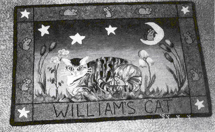
"William's
Cat"
Original
Submitted by Peggy Hannum,
Lancaster, PA
McGown Newsletter, Vol. 31, #2, Spring 2002
|
|
"William's Cat" is a whimsical picture
story about my grandson William's pet,
named "Fish." As nine year old William
likes to tell it, "He is the only fish
with fur!" Sadly, however, Fishy died in
mid-hooking after a rather long and
happy career pursuing mice. I was
concerned that William might not want me
to continue, but he said that he would
like to have a rug to remember his kitty
by, and that he would hang it in his
room. William talked to me about Fishy's
attributes, and he pronounced him a good
"mouser." So, the provenance of the back
of the rug begins: In Memoriam to a
Fine Mouser.
I began the rug with a photograph of
Fish which I redrew onto linen backing.
I wanted the background to be a night
sky with a touch of dawn, probably
Fishy's finest hour! I talked to Nancy
Blood about how to dye a night sky. She
suggested that I use a half-yard of pink
wool and dip dye it using 1/8 Black and
1/8 Navy Blue in a large pot. I cut the
whole piece putting the strips in order
on 3" paper tape. After hooking 2 rows
across the width of the sky, I could
figure on 4 strips to complete one row
across. So far, so good ...
However,
when I had hooked half of the sky, 1
realized that I would need more, so I
repeated the dyeing process with another
quarter-yard, which, of course, did not
come out exactly like the first piece. I
cut the new piece, put it on tape and
lined up the two tapes. The result was
far better than if I had dyed it all at
once as I had lovely streaks and
variations in the lighter end of the
sky. The story doesn't end here! I was
running out again! I dyed a third piece
and cut and lined these up beside the
other two. Again, I had more variations.
The lesson for me here was that the
mistakes in dyeing are sometimes more
fortunate than doing it precisely
correct in the first place.
I was
going to the Highlands weekend when 1
first started hooking the cat. Helen
Johnson was my teacher, and with her
expert help, I did most of the face that
weekend. I had not done an animal
before, so was very pleased with myself
when I had finished what I thought was a
very good eye the first evening, only to
discover the next morning how difficult
it was to do a second eye that matched!
Helen had
suggested to me that I dye the cat by
putting two small pans on the stove,
prepare two dye cups: 1/4 Silver Gray in
half CBW and 1/8 Light Brown in a half
CBW; spoon each dye into its separate
pan starting with 3 Tablespoons of dye
plus vinegar. Then I took 3" x 9" pieces
of wet white wool, dipped one end about
1/4 to 1/3 into the gray, pulled it out,
turned it upside down and let the dye
run a bit, dipped the other end into the
brown and did the same. I did this
numerous times to get various shades and
gradations to match the fur colors.
These pieces of dyed wool along with a
few bits of black and white worked very
well to recreate the exact color in my
picture. The border picks up the rusty
brown color in the fur: Dotti Ebi's Spot
47 over Dorr Butterscotch.
Folk Art
often tells a personal story, and may be
drawn by the artist. Most often, a
primitive effect is achieved and wider
cuts are used. I do not comfortably hook
using a wide cut, so most of the rug is
3 and 4, which is to say that folk art
does not necessarily have to fit into
one mold. Since Fish is no longer with
us, a few more happy mice around the
border and on the moon, gives the
feeling of what it might be like in
Mouse Heaven. |
|
|
"Manchu
Dragon"
(#1035-22"x28")
Jane McGown Flynn
Adaptation from an Existing Pattern
Submitted by Peggy Hannum,
Lancaster, PA
McGown Newsletter, Vol. 31, #4, Autumn 2002
|
|
Somewhere
back in my hooking past, nearly 25 years
now, I formulated the idea that "rug
hooking" meant RUGS. Until recently,
things that hung on walls, plumped on
sofas or graced tables, received only my
raised eyebrow and a bit of a sniff.
After four years of instructors'
training and teaching, my views have
somewhat changed. I now have an
abundance of unrug-like things adorning
walls, sofas and sundry other bare
spots!
However,
when I decided 1 wanted to do a dragon,
I reverted back to RUG, but there were
no dragon rug patterns. I discovered a
picture in the New York Times Sunday
Magazine section, a full page ad for
a beautiful golden dragon rug with a
deep purplish background and lavender
and mauve clouds. There was my dragon
rug! I decided to order the wall
hanging, "Manchu Dragon" on a larger
piece of burlap and basically use the
complicated scaly body of this small
piece. By tracing the bottom half of the
body and turning it down, I had a
wonderful, full length dragon body
already drawn thanks to Jane Flynn's
detailed design. I redrew the head
replete with a long and soon to be red,
dragon-y tongue, redrew the clouds to
enlarge them, and moved the flaming orb
out to accommodate the space. At that
point, I sent the New York Times
picture to Nancy Blood with whom I was
taking a workshop at Laurel Mountains.
It now measures 32" x 43."
Nancy is
a master of color planning who because
of her willingness to share, teach and
pass on her expertise, has taught me a
wealth of understanding about dyeing and
the use of exciting color combinations.
Nancy has the gift of simplifying a dye
plan by using one set of dyes over
various shades of wool. The dragon is
simply outline and fill with four shades
of golden yellow using the same dye in a
pan over different shades of wool. The
same process created the clouds. Add to
this the beautiful abrashed background
and that was the dyeing procedure.
"Manchu
Dragon" has become a family favorite and
taken on the title of "Norbert" of Harry
Potter fame. Both my husband and my
9-year-old grandson have laid claim to
THE DRAGON who has definitely become "a
guy thing."
Color
Plan and Formulas
Background: over 1 yard
of Woolrich Mona Gray 906. ABRASH:
fill large pot 3/4 full of
water; bring to a boil adding 1/2
cup vinegar and 1 Teaspoon salt.
Pour half the formula in pot first,
add wet wool and then spot with rest
of formula.
Formula: 2 Sky Blue +1 Bright
Purple + 1 Golden Brown - all
together in 1 CBW.
Cook about 20 minutes, allow to
cool.
Dragon: Formula: 1/8 Buttercup
Yellow + 1/4 Peach + 1/16 Golden Brown
in 3/4 CBW + 1/4 cup vinegar. Using 3
small pans and 3 shades of wool (Woolrich
Natural 100 and Peach 500 and Dorr Corn
8719), start with 12" x 36" piece of
Natural for lightest and 2 teaspoons of
dye solution; then 12" x 18" of Corn and
2 teaspoons of solution for a medium;
12" x 18" of Peach and 5 teaspoons of
dye solution for darker; and 12" x 18"
of Peach and 4 Tablespoons of dye for a
darkest value. I also had a light orange
piece of wool that I dipped into a
weaker dye bath to outline the scales.
Clouds: use 4 shades of wool:
Woolrich Pink 416 and Mona Gray 906,
Dorr 73 (Mauve) and Corn 8719.
Formula: 1/8 Sky Blue + 1/16 Bright
Purple + 1/16 Golden Brown in 3/4 CBW +
1/4
cup vinegar. In 4 pans using 12" x 12"
pieces of each wool, first put 1
teaspoon of dye over Pink, then 3
teaspoons in second pan over Mauve,
then 1 1/2 teaspoons over Corn and 1
teaspoon over Mona Gray.
You may
vary the amount of dye in each pan for
both dragon and clouds as 1 developed
these amounts by using my newspaper
picture and just working with amounts
until I had what I wanted. Don't throw
away left over dye as you may need to
dye more pieces of wool to finish.
|
|
|
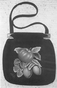
"Fruit"
(#P750-8"x l0")
Jane McGown Flynn
Submitted by Peggy Hannum,
Lancaster, PA
McGown
Newsletter, Vol. 29, #2, May 2000
|
|
Having
come home from my second year at
Northern Teachers' Workshop with yet
another "small" project, I put "Fruit,"
on the back shelf. First of all, I
really don't care to do the small ones;
after all, "A rug is a rug is a rug " to
paraphrase Gertrude Stein. Secondly, 1
hadn't even started it as it was
too little to Fit my frame at Workshop,
and being a Friday morning project, I
hadn't much time anyway. And lastly, I
didn't have to have it finished for a
whole year. "I'll think about it
tomorrow," said Scarlett. These all
sounded like valid excuses to me.
Several
months later, tomorrow was fast
approaching, but procrastination gives
inspiration time to percolate. I had a
lovely black wool pocketbook I had made
many years ago during my twenty-year
"apprenticeship" with Meredith LeBeau
when I lived in Massachusetts. |
 |
|
I had
used the bag so much that it would need
relining! I could cut down "Fruit" to an
8" square and use it as another tile for
my bag. Now came the real
challenge. In all of my years of
hooking, the only fruit I had done were
strawberries. Again, Meredith came to
the rescue. I leafed through my notes
from her classes, and there were all of
her handouts on fruit, vegetables and
flowers-dutifully annotated during her
classes on shading. The apple had to be a Macintosh; being a New Englander, no other variety ever crossed
our threshold-well, maybe a stray Cortland here and there. I went through all the
swatchettes and the perfect green to red "Mac" was #16 from Anne Ashworth's Chroma
Craft >dyebook. The strawberries were a snap. I'd done a whole rug full of them; that is
to say, almost done. It is still languishing in the pile of "the great unfinished." I had used TOD 161,8 values, regular gradation. For strawberry seeds, Meredith had suggested one
thread from a strip of yellow and one thread from a strip of black, hooked together, one
loop with two ends up. However, on this small piece, I used just one loop with the ends
loose on the back. Since it is not a rug, they will probably stay put; a dab of glue will also
hold them. Since this was a project for Workshop, I decided to use two different shades
of purple for the plums: one reddish purple, Color Flow 86; the other, blue-to-purple, Ethel
Bruce's 106. For the leaves, three different Connie's Cauldron formulas; one a grey green,
one light green, one a bluer green. The background is plain black to match the fabric of
the purse.
To finish off the tile, put So-Bo Glue on the back after the piece is hooked, two rows
onto the hooking and two rows onto the burlap. Allow the glue to dry for twenty-four hours,
Cut along the hooked edge. Using a black, indelible marking pen, run it along the
cut
edge to cover any burlap still showing. Sew velcro squares on the four
corners to match
the opposite pieces on the handbag, and voila, yet another replaceable tile for your
pocketbook-a tile for all seasons!
Because most of the swatch formulas are commercially available through
dyebooks, the
only one given here is Ethel Bruce 106, a wonderful blue-to-purple:
Color #1: in '/2 CBW - 1/16 Turquoise Blue (1 Tablespoon in each jar)
Color #2: in 1 CBW - 1/4 Plum (regular gradation)
|
|
|
"Queen
Mary"
(OSV 699 - 38"x 72")
Pearl K. McGown
Submitted by Peggy Hannum,
Lancaster, PA
McGown Newsletter, Vol. 29, #3, Aug 2000
|
|
Crewel is
wonderful! It is pure fantasy! Although
most of us are far removed from
kindergarten when it was all right for
the sky to be green and the grass to be
blue, there is something very whimsical
about pink pomegranates, blue daisies,
gray-green tulips and caterpillars
striped to match. I began the "Queen" in
April, 1998, at Maryland Shores Rug
School with Nancy Blood. She had been
hanging around my stash of
"someday-I'll-do-it" patterns for quite
a long while; actually, so long that the
price was practically minuscule! I
wanted a large rug for the master
bedroom that would go nicely with the
flowered drapes and spread. Equipped
with a swatch of the fabric, Nancy did
her magic. I have a rug that echoes the
bedroom colors beautifully.
Dyeing, using Nancy's suggested formulas, was a learning process in that all of the greens,
(four in fact), used the same dyes over different pastel wools as did the blues and grays.
I started with the center; everything went smoothly and I was able to get a start on all the
different motifs during the week-long camp with Nancy. However, by the time Northern
Teachers' Workshop came along at the end of July, 1 had enough finished to cast an
anxious eye toward the rope border. I brought it along to run by Nancy again. What 1
encountered, however, was a dorm room full of the "masters" and came away loaded
with suggestions. Nancy advised a single line of the spot on the inside of the rope and a
double line on the outside which gave the twists an excellent finished look. Annie Spring
suggested a double line of the middle values of each color in the center motifs separating
each turn of the rope-which was brilliant! It gave a subtle, jeweled effect to the edge and
pulled it all together. Others mentioned a gold rope, or maybe a green one, to make it a
bit different. I tried each idea, but inherent in the beauty of the hooking art, one can try
this or that and then decide what is just right. Neither gold nor green really worked, so 1
dyed an 8-value brown to match the trunk and stem and used only values 2-7; the 1 and
8 were too sharp.
This rug was a delight to hook. Whenever I look over my frame with its present hooking
project, 1 once again delight in the golden cups with their sea-green centers. All that is
needed to complete the fantasy is a hummingbird and fairy wings. Maybe next time!
Nancy Blood's Suggested Formulas and Color Plan for "Queen Mary"
Background:
Stained Glass 13 over ivory wool -
hooked across in rows to resemble
the woven linen tapestry.
Vine:
Nancy Blood's "Tree Trunk" over 1/2
yard of beige or tan-brown texture
1/8 Dark Gray
1/8
Golden Brown each in its own 1
CBW + 4 T vinegar
1/8 Seal Brown use favorite spot-dyeing method
1/16 Mahoganv
A -
Grapes/Small Daisy Flowers: Maryanne
Lincoln's Country Colors "Navy Blue"
2 swatches (3x12 per swatch) over blue
and 2 over silver gray. Use gray
swatches for these.
B - Pomegranates/Carnations:
Maryanne Lincoln's Country Colors "Pink
Blush"
4 swatches over white.
C - Pointed
Daisies/Fantasy Grapes: See "Navy
Blue" above.
Use blue
swatches for these.
D -
Maryanne Lincoln's Country Colors "Old
Gold" over natural or ivory wool.
E -
Maryanne Lincoln's Country Colors "Khaki
Green"
4 swatches, 2 over mint and 2
over silver gray.
F - See
"Old Gold"
G - Worm: Pull in all the colors
used in the rug.
Leaves:
Maryanne Lincoln's Country Colors "Moss
Green"
2
swatches over mint, 2 over silver gray,
2 over pink, and 2 over blue.
Intermingle colors throughout.
Spot:
Over 1/2 yard mint
1/8 Navy
Blue
1/8 Old
Rose See Nancy's "Tree Trunk"
method mentioned earlier
1/8 Old Gold
Use on
inner and outer edges of rope, acorn
heads, centers and turnovers of leaves
and tendrils.
Rope: Maryanne
Lincoln's Country Colors "Seasoned
Basket"
8 values, used only values 2-7.
Nancy's
method of jar dyeing:
8 jars with 1/2
teaspoon of salt in each; spoon: 1/2 - 1
- 2 -3 - 5 - 9 - 14 -
Remainder of cup. Stir
every 15 minutes; add vinegar at the
half hour.
(go back up to top of page) |
|
|
|
|